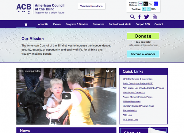
American Council of the Blind needed a re-brand and a new website. They'd been around for over 20 years and operated with the same marketing material they started with. They had a website, but it hadn't been touched in over 10 years. It was visually unappealing and out-of-date with the current web content accessibility guidelines (WCAG).
Our solution was to re-brand the company with a new logo and color scheme along with a new website with an emphasis put on greater accessibility and outreach. The navigation and content accessibility web pages were built according to the WCAG 2.0 level AA, with some level AAA attained without sacrificing design aesthetics.
After launching the site in the summer of 2018, ACB's user base was extremely happy with the new feel and greater ease of use. We continue to bring their users high quality content and support through the power of Drupal.


